The variety of colors that we choose to use in our spaces give the world of modern home design a vibrant feel. Each hue carries a unique charm and an energy that can profoundly influence the aesthetics and ambiance of our homes. This influence, however subtle, is what helps shape our living experiences, making color an essential design element in contemporary home décor.
Diving deeper, the significance of colors in home design extends beyond mere aesthetics. As a designer, homeowner, or an enthusiast, you might be surprised to learn how colors can impact our mood, behavior, and overall perception of a space. This is why understanding the psychology of colors and their meanings is crucial to creating a harmonious and emotionally balanced home environment.

So, let’s embark on a colorful journey that explores the role and impact of color choices in modern home design. We will delve into the psychology of colors, their meanings, how to select a home color palette, and much more.
Understanding the Psychology of Colors
The psychology of colors is a fascinating realm that studies how colors can influence human behavior, emotions, and mental states. It’s a significant principle that designers and artists have been leveraging for centuries to create impactful designs and experiences.
For instance, warm colors like red, orange, and yellow are known to evoke feelings of comfort, warmth, and happiness. They stimulate the senses and can energize and invigorate a space. On the other hand, cool colors like blue, green, and purple are associated with feelings of calm, tranquility, and relaxation. These colors can help create a soothing and peaceful environment, perfect for relaxation or contemplation.
Understanding the psychology of colors is not just about knowing what each color represents. It’s about understanding how these colors interact with each other, how they influence our perception of space, and how they can be strategically used to create specific moods and effects in our homes.
The Significance of Colors and Their Meanings in Home Design
In the context of home design, colors and their meanings carry a significant weight. Each color possesses a unique character that can influence the overall vibe of a room. For instance, red, a color often associated with passion and energy, can make a room feel lively and dynamic. Conversely, blue, a color linked to tranquility and calmness, can make a space feel serene and peaceful.
Similarly, colors can also influence our perception of space. Light colors like white, beige, and pastels can make a room appear spacious and bright, while dark hues like navy blue, forest green, and charcoal can make it feel cozy and intimate.
The colors we choose for our homes essentially become a reflection of our personality, tastes, and the vibe we wish to create. Therefore, understanding colors and their meanings is a crucial step in crafting a home that resonates with our unique style and aspirations.
How to Select a Home Color Palette
Selecting a home color palette is an exciting yet challenging task. It requires a careful consideration of several factors including your personal style, the architectural elements of your home, the amount of natural light available, and the mood you wish to create.
Start by identifying your base color, the primary color that will serve as the backdrop for your design. This color should resonate with your style and the overall vibe you want for your home. Next, select a few accent colors that complement your base color. These accents can be used for smaller elements like furniture, decor, and accessories.
When selecting your palette, it’s also essential to consider color harmony. Colors that fall next to each other on the color wheel (analogous colors) create a harmonious and calming effect, while those opposite each other (complementary colors) create a vibrant and dynamic contrast.
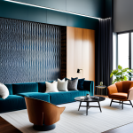
Home Decor Color Palette Ideas for Your Living Room
The living room is often the heart of a home, a space where we relax, entertain, and spend quality time with loved ones. Therefore, the color palette you choose should reflect the activities and mood you want to foster in this space.
For those who prefer a serene and calming ambiance, a palette of blues and greens can be an excellent choice. These colors, inspired by nature, can help create a soothing and relaxing environment. Pair these with neutral accents in beige or white for a balanced and harmonious look.
Alternatively, if you wish to create a lively and energetic space, consider a palette of warm hues like red, orange, or yellow. These colors can stimulate conversation and create a cozy, inviting atmosphere. Balance these bold colors with neutral or cool accents to prevent them from becoming overwhelming.
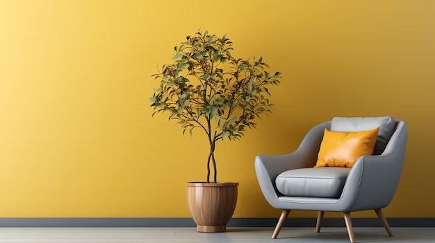
Room Color Palette: Choosing the Right Colors for Bedrooms and Bathrooms
The bedroom is a sanctuary, a place for rest and rejuvenation. Therefore, calming colors like blues, greens, or pastels are ideal for this space. These colors can create a tranquil and relaxing environment conducive to sleep. Pair these with neutral or white accents for a clean, refreshing look.
Bathrooms, on the other hand, can benefit from brighter, more energizing colors. Consider a palette of yellows or oranges to create a vibrant and invigorating space. These colors can make your mornings more cheerful and help kickstart your day on a positive note.
Kitchen and Dining Room Paint Color Scheme Choices
The kitchen and dining room are spaces where we cook, eat, and bond over meals. Therefore, these areas should feel warm, inviting, and stimulating. Consider a palette of reds, yellows, or oranges, colors known to stimulate appetite and promote a sense of warmth and comfort.
Alternatively, if you prefer a more modern and sleek look, consider a monochromatic palette of blacks, whites, and grays. This palette can create a sophisticated and minimalist environment perfect for a contemporary home.
The Impact of Color Choices on Mood and Ambiance
The colors we choose for our homes can greatly influence our mood and the overall ambiance of our spaces. Warm colors like red, orange, and yellow can create a cozy and inviting atmosphere, while cool colors like blue, green, and purple can evoke a sense of calm and tranquility.
Moreover, colors can also manipulate our perception of space. Light colors can make a room appear larger and more open, while dark colors can make it feel smaller and cozier.
Therefore, when selecting colors for your home, consider not only their aesthetic appeal but also their psychological effects. This will help you create a home environment that is not only visually pleasing but also emotionally balanced and harmonious.
Case Studies: Effective Use of Color in Modern Home Design
Let’s take a look at some case studies that effectively demonstrate the use of color in modern home design. These examples showcase how different color schemes can transform a space, influence its mood, and enhance its overall aesthetic appeal.
In one case, a designer transformed a small, dark apartment into a bright and spacious home by using a palette of whites and pastels. The light colors visually expanded the space, making it appear larger and airier. Accents of blue and green added a refreshing touch, creating a calm and tranquil atmosphere.
In another case, a designer turned a dull and dreary living room into a lively and dynamic space by using a palette of reds and oranges. These warm colors infused the room with energy and warmth, making it feel more inviting and comfortable.
Conclusion: The Power of Color Choices in Home Design
Color is a powerful design tool that can transform a space, influence our mood, and reflect our personality and style. By understanding the psychology